I think it's time for an ACH (click for an introduction to ACH) on the much discussed tapering issue, more so, as it looks likely to be announced at the December 17-18 meeting (by tapering I also mean the communication that precedes the actual slowdown in QE).
So the hypotheses are:
H1 - the Fed will taper at the December meeting;
H2 - the Fed will not taper at the December meeting.
Here is a matrix with a score measuringmy judgement on how much each piece of evidence invalidates each hypothesis.
Evidence H1 H2
---------------------------------------------------------------------------------------------------------------------------------
E1 - the economic indicators have been strong lately
and the Fed wanted to start tapering in September + -0.75
E2 - the latest GDP report has been strong but only
due to rising inventory -0.25 +
E3 - the Fed has not started to communicate its
possible tapering intentions yet -0.75 +
E4 - a slowdown in Q4 is expected -0.25 +
E5 - Bernanke could take upon himself the responsibility
to announce the taper + -0.5
E6 - the December meeting is followed by a press
conference, a good opportunity to start tapering + -0.75
communication
E7 - the stock market has risen and the bond market
was flat after the strong NFP report, which could + -0.5
encourage the officials to start tapering sooner
E9 - inflation is still trending lower -0.5 +
E10 - the 7% unemployment threshold, which
has been mentioned by Bernanke early 2013, has + -0.5
been reached
---------------------------------------------------------------------------------------------------------------------------------
Total -1.75 -3.00
Conclusion:
H1 is less invalidated, so it wins. The mechanical conclusion of the analysis is that the Fed will start at least communicating the taper at the next meeting.
What should be seen if, indeed, the Fed were to taper? I would guess that some early signaling by Fed officials (today there are three such speeches) but also the markets could anticipate such a decision somehow - the markets were not taken by surprise in September when tapering was postponed even if everybody was ready for it to happen.
Lastly, the conclusion of this analysis is not to be taken for granted. This framework is more of a way to put arguments in order and to see the pivotal ones. Expressing conviction in probabilities is much better. In this case, I would say there is a 60% chance for the Fed to start at least communicating the tapering.
Monday, December 9, 2013
Monday, November 25, 2013
Intermediate Term Top
Here is a chart of the weekly S&P 500.

I measured all the bull uplegs and the intermediate term corrections. Generally, twenty-and-something percent uplegs are followed by shorter ones. Measuring from the June low, the latest bull leg has already been 16% long, so, since the market is up against the 1800 resistance, and already committed above it, I think a drop has to happen very soon. The following correction would be somewhere between 7 and 10 % long.
I measured all the bull uplegs and the intermediate term corrections. Generally, twenty-and-something percent uplegs are followed by shorter ones. Measuring from the June low, the latest bull leg has already been 16% long, so, since the market is up against the 1800 resistance, and already committed above it, I think a drop has to happen very soon. The following correction would be somewhere between 7 and 10 % long.
Saturday, November 2, 2013
New Orders Index
"Anyone who has studied markets half-seriously learns not to associate vigorous economic activity with stock market bottoms, but with stock market tops."
Will Rahal.
Here is an up to date chart of the New Orders Index.

In the vein of the opening quote, it is hard to be bullish over the intermediate term given this chart. I do not think we can talk of a bull market top yet but a larger correction is not out of the question soon. Meanwhile, the short term looks good, with 1800 as next stop.
Here is an up to date chart of the New Orders Index.
In the vein of the opening quote, it is hard to be bullish over the intermediate term given this chart. I do not think we can talk of a bull market top yet but a larger correction is not out of the question soon. Meanwhile, the short term looks good, with 1800 as next stop.
Friday, October 25, 2013
Employment

The average rate of growth in private payrolls has slowed down steadily during the last months to a level that may mark an inflection point. Any lower than this and the economic expansion is in peril, similar to 2007. We could see a bounce from here, the most likely scenario, but it could tip the Fed towards tapering early next year.
Sunday, October 20, 2013
NYHL
I have talked recently about signs of a peak in the business cycle, but the stock market is ignoring them.

The chart above is that of the difference between the 52-week New Highs and the 52-week New Lows for the NYSE.
The rally in 2013 was accompanied by a huge expansion of new highs vs. lows and this is still the case on the latest surge to historic highs for the S&P500. This often signals short term capitulation, but the longer term implications are positive for the overall bull.
For me, the latest bull leg has began at the end of June, after the 7% correction, and it is up 12% as of Friday. A 16% rise, which is quite average, would take the market to 1800.
Thursday, October 17, 2013
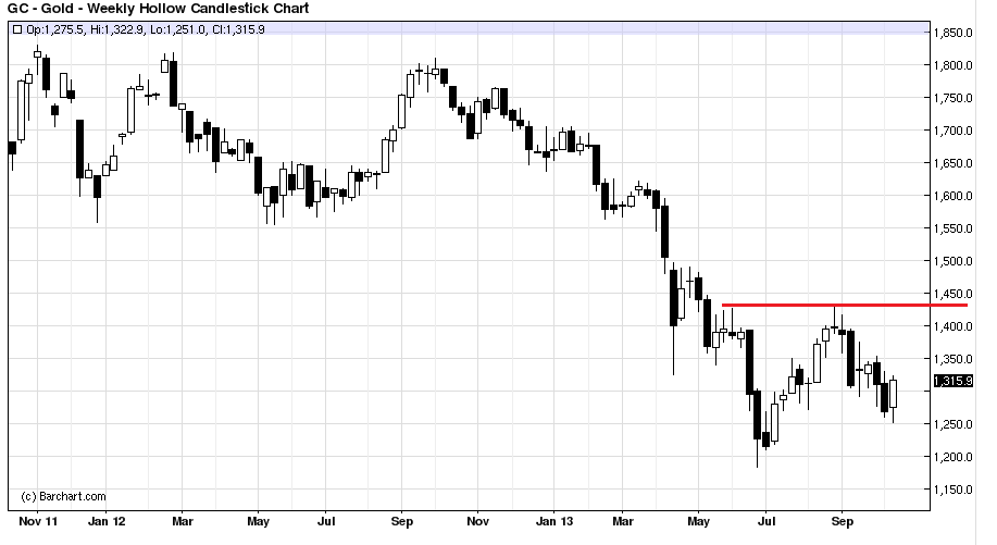
Treasuries and Gold

The chart above shows the December weekly futures contract for the 10-year T-Note.
The T-Notes have a good track record of anticipating turns in the business cycle and, implicitly, in the stock market. The rise in September and the possible trend reversal if the highlighted level is broken, are similar to the behavior at the 2007 and 2011 peaks, confirming the scenario of at least a slowdown in the economy.
If we interpreted Gold as a fixed income asset (here is why), then it has a lot of upside potential. Gold also started rising in the past just before major economic slowdowns.
Here is a weekly chart of the December contract for Gold.
Friday, October 11, 2013
GDP

The chart above is that of the quarterly percent change in real GDP with a 4 period moving average (blue line).
The weakness of this recovery is clearly visible. The average has not reached the level of 1% (marked by the red segment) as it did during the previous expansions. This is coming after a very sharp contraction so it is not a good sign for the long term.
Also, the average has crossed the purple horizontal line from the upside during bear markets. It is now very close to it again. With the GDP expected to have slowed down in Q3, we might get a signal again very soon.
Wednesday, September 25, 2013
Wednesday, May 22, 2013
May 22 - new strength
After several ignored intermediate term top signals and new all time highs the market looks recharged. The technical picture, given some indicators for the intermediate term, is the same as it would be after an initial thrust at the start of a new bull leg. Divergences in breadth and momentum are all negated. It's time for a pull back but this is a buy.
For breadth, here is a moving ratio of cummulative advancing versus declining volume for a 1-2 months period:
 I've marked the previous divergence that most of the time ends with a bigger correction, as well as the new thrust higher. I did the same for other two breadth indicators:
> the percent of S&P500 stocks above their respective 50 DMAs

> the 13 day EMA of TRIN

For momentum, I chose the average rate of change over a 1 to 2 month period.

This leads to the conclusion that the market is not ready for a 7-10% correction. I think it corrects for just 3 to 5 % into the 1600 -1620 zone and then resumes the climb. There is not much upside left as the bull leg is already 25% long, but a 30% rise already happened during this bull. This would mean a target around 1750.
Here is a weekly chart.

For breadth, here is a moving ratio of cummulative advancing versus declining volume for a 1-2 months period:

> the percent of S&P500 stocks above their respective 50 DMAs

> the 13 day EMA of TRIN

For momentum, I chose the average rate of change over a 1 to 2 month period.

This leads to the conclusion that the market is not ready for a 7-10% correction. I think it corrects for just 3 to 5 % into the 1600 -1620 zone and then resumes the climb. There is not much upside left as the bull leg is already 25% long, but a 30% rise already happened during this bull. This would mean a target around 1750.
Here is a weekly chart.

Monday, May 6, 2013
May 6 - the top is close ... again
This time it should be for real. The market is not too far from strong resistance and it has just rallied above the 1600 level. Given the growing weakness of the rally from November, a correction is looming.

Indeed, divergence of this kind in the 13d ema of TRIN has generally signaled an intermediate term top when the market was at strong resistance.

Indeed, divergence of this kind in the 13d ema of TRIN has generally signaled an intermediate term top when the market was at strong resistance.
Monday, April 29, 2013
April 29 - update
The attempt to turn lower at the end of last week is failing. The market is strong and it will most probably make new highs before a correction starts.
The next few days can still be volatile because the market is overbought, but the ECB announcement on Thursday will pull the market higher in anticipation. Maybe it will also offer a good opportunity to sell before the employment report.
Wednesday, April 24, 2013
April 24 - it's time for another leg down
The deceleration in retail sales has continued since I last wrote about it.

Meanwhile, the stock market has been consolidating near its highs. It is time for it to play catch up.

Especially as the daily chart has become committed to the upside yesterday by closing strong and above a visible inflection point on the chart and also above the monthly resistance level at 1576.

Meanwhile, the stock market has been consolidating near its highs. It is time for it to play catch up.

Especially as the daily chart has become committed to the upside yesterday by closing strong and above a visible inflection point on the chart and also above the monthly resistance level at 1576.
Thursday, April 18, 2013
April 18, 2013 - Covered short at 1541
The market still looks weak but it could start a bounce from the 50 DMA.
Thursday, April 11, 2013
April 11, 2013 - I got short at 1584.75
I had left a sell order overnight. The rally to new highs is weak and this bull leg should be over.
The market has already surged and settled above the 2007 high so the risk is minimal. I will hold on to this position even if the market does not sell off right away.
April 13 - Update: Everybody seems to be expecting a correction (see here and here). So, I think the market is close to a top but may reach 1600 on the S&P500 first. I will hold my position even if this happens, as I think the correction will reach at least the 1500 level.
Saturday, April 6, 2013
April 6, 2013 - slowdown confirmed, gold to bounce
The employment data that came on Friday generally confirms the slowdown I talked about in my previous post.
Here is a chart of a short term rate of change in employment. The series has further to fall.

From another point of view, this slowdown in employment may very well have marked the top for this recovery. Here is a yearly percent change in private payrolls (excluding health & education payrolls which are not cyclical).

The top is already in place from last year. In previous cases the series continued its fall.
During the previous bull it had topped in April 2006 and the market followed only more than a year after. This is why this bull market, even if quite old, has further to go.
Meanwhile, the price of gold has reached the bottom of a long trading range.

As I wrote in my previous post about gold, its price is rising in anticipation of economic weakness, and falls when the economy accelerates. I have anticipated the economic slowdown, but gold continued to fall. This may suggest further weakness this year.
But until then, gold is at important support and is a short term buy as it bounces during the correction in the stock market. Then, the time will come for another leg down as the correction on the monthly chart could be bigger than 20%.
Here is a chart of a short term rate of change in employment. The series has further to fall.

From another point of view, this slowdown in employment may very well have marked the top for this recovery. Here is a yearly percent change in private payrolls (excluding health & education payrolls which are not cyclical).

The top is already in place from last year. In previous cases the series continued its fall.
During the previous bull it had topped in April 2006 and the market followed only more than a year after. This is why this bull market, even if quite old, has further to go.
Meanwhile, the price of gold has reached the bottom of a long trading range.
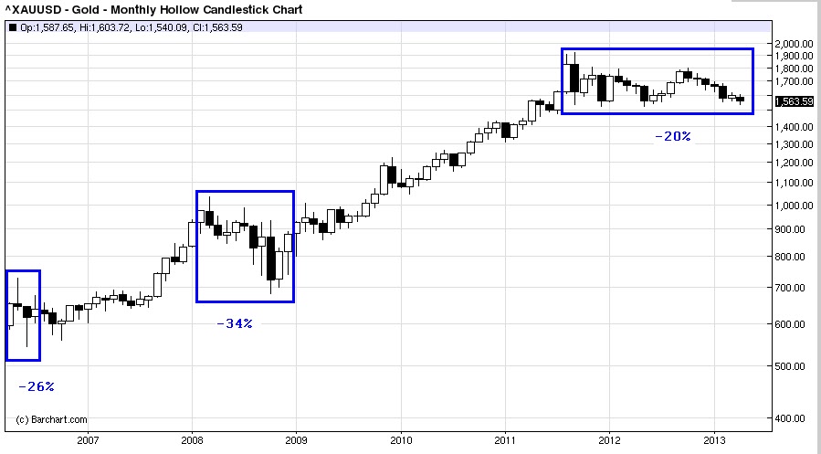
As I wrote in my previous post about gold, its price is rising in anticipation of economic weakness, and falls when the economy accelerates. I have anticipated the economic slowdown, but gold continued to fall. This may suggest further weakness this year.
But until then, gold is at important support and is a short term buy as it bounces during the correction in the stock market. Then, the time will come for another leg down as the correction on the monthly chart could be bigger than 20%.
Tuesday, April 2, 2013
April 2, 2013 - correction just around the corner
It's been a nice 18% run, but it's over. The market is up against strong resistance and the short term breadth is awful. Such a pessimist tone is not appropriate because the bull is not over, but, still, a 7-10% correction is just around the corner.

I drew resistance on the monthly chart above. There were many other important levels that did not manage to shake the market for more than a few days, but this is the ultimate level - the high from 2007. The market will most probably rise and close above this level and then turn lower in the following days.
Here is an indicator of breadth that shows important divergence - the 13d ema of TRIN.

The weakness of this indicator has been disregarded by the market in the recent past. In fact, I was expecting a larger correction based on this indicator in my previous post. The big difference now is that the market has already risen by 18% and it is making record highs.
There are also some economic indicators that are sensitive to intermediate term fluctuations in economic activity. These are quite correlated to the market and they are suggesting a slowdown.
Here is the 3 month average of the New Orders vs.Inventories ratio,

the US PMI, which has turned lower recently,

the pace of change in Retail Sales, also turned lower,

and the pace of change in Employment (private payrolls)

Over the long term the bull is still alive. Employment in the US has been doing constantly ok and this should fuel the expansion at least until the end of the year. Overseas, The Chinese PMI has started to rise strongly and even the European economy is at the beginning of an acceleration phase.
Here is the Business Cycle Clock from Eurostat, showing the European Economic Sentiment Index (ESI), an indicator that leads economic activity and even the markets.

Thus, a correction that stays within the parameters of a bull market is a buy. It will probably reach the 1420-50 zone, but this level is just a wild guess for now.
Monday, January 21, 2013
January 21, 2013 - long term strength, short term weakness
The bull market is showing good strength over the long term, but the short to intermediate term is not looking very good.
Here are two long term indicators that have reached new levels of strength for this bull and are breaking the pattern of multiple divergences associated with bull market tops.
> NYHL - 52 week new highs - lows

> the percentage of S&P 500 stocks above their respective 50 day moving average.

This suggests the bull may enter an acceleration phase, a fact also supported by the strength in employment and housing. These may have reached their peaks for the recovery, but no bull ends before these indicators have weakened for a while.
Here is a a rate of change in the unemployment rate and a housing market index.


Meanwhile, shorter term indicators are not so good looking. Breadth, as expressed by the 13 day EMA of TRIN, is clearly diverging with the market.

This kind of divergence signals a bigger correction with great precision, especially when the environment is favorable, as suggested by the record low VIX...

... or, by the slowing down pace of change in retail sales.

Usually. a more important correction comes after a significantt level of resistance is hit on the long term charts. Here is the monthly SPX.

The market has just broken above the previous highs, 1474 - a possible level. The next one to the upside is 1522 - a bit far, but not unreachable.
Which one is it? My guess is 1474, but it's only a guess. We'll get a first clue during the following days. The market has committed on the daily chart above the previous highs, so at least a small correction is in order. The market could tip its hand on this correction.
Here is the daily SPX.

Here are two long term indicators that have reached new levels of strength for this bull and are breaking the pattern of multiple divergences associated with bull market tops.
> NYHL - 52 week new highs - lows
> the percentage of S&P 500 stocks above their respective 50 day moving average.
This suggests the bull may enter an acceleration phase, a fact also supported by the strength in employment and housing. These may have reached their peaks for the recovery, but no bull ends before these indicators have weakened for a while.
Here is a a rate of change in the unemployment rate and a housing market index.
Meanwhile, shorter term indicators are not so good looking. Breadth, as expressed by the 13 day EMA of TRIN, is clearly diverging with the market.
This kind of divergence signals a bigger correction with great precision, especially when the environment is favorable, as suggested by the record low VIX...
Usually. a more important correction comes after a significantt level of resistance is hit on the long term charts. Here is the monthly SPX.
The market has just broken above the previous highs, 1474 - a possible level. The next one to the upside is 1522 - a bit far, but not unreachable.
Which one is it? My guess is 1474, but it's only a guess. We'll get a first clue during the following days. The market has committed on the daily chart above the previous highs, so at least a small correction is in order. The market could tip its hand on this correction.
Here is the daily SPX.
Subscribe to:
Posts (Atom)